

Decor & Color
Choose a color scheme that reads true against the Barn's wood and light.
The barn’s beams, exposed wood, and open light change how color looks. Here’s what actually works on this floor, not a generic list.
4.9 · 1,400+ Google reviews Three venues, one estate Booking 2027 & 2028
Start With The Room
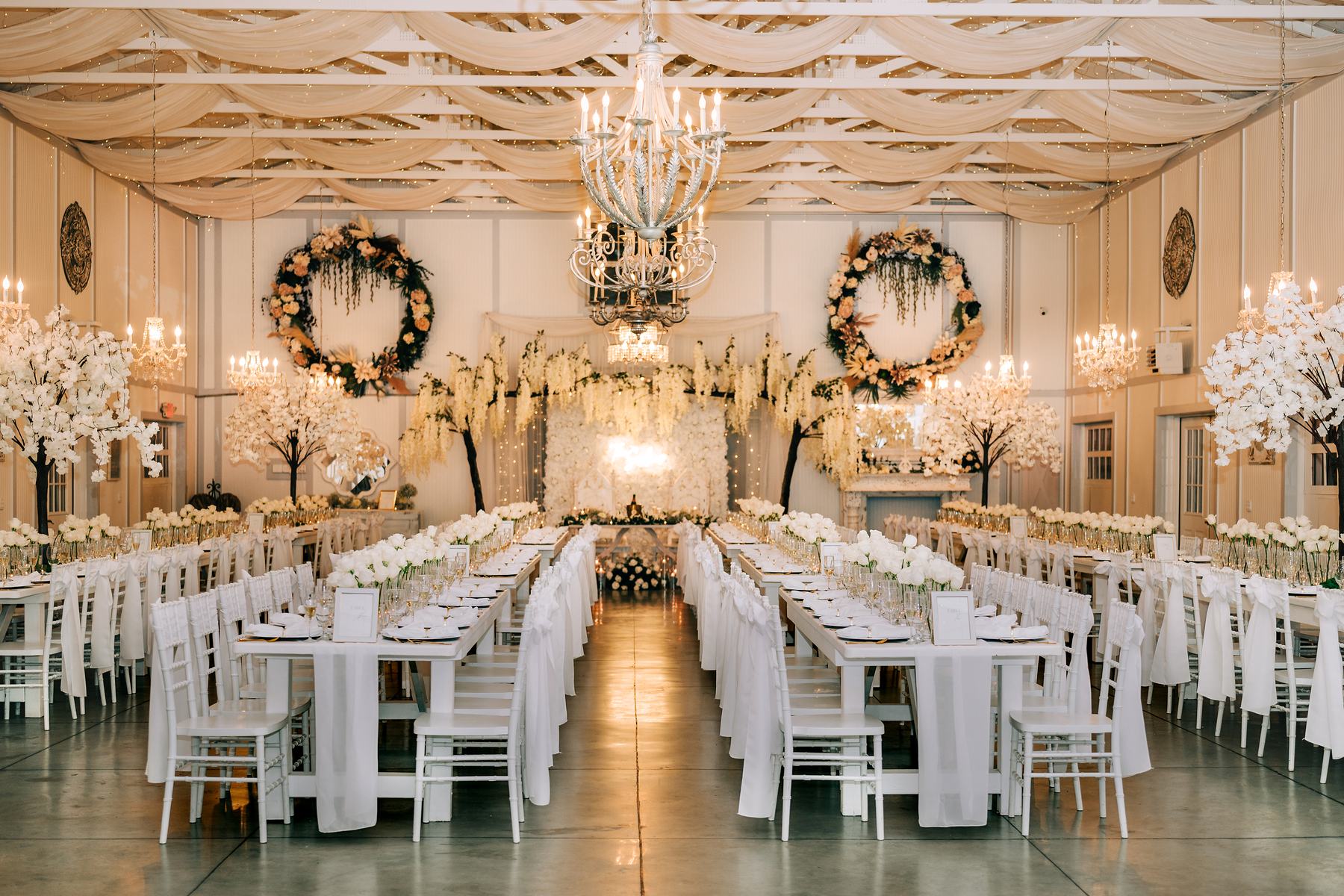
The barn already has a color scheme before you add one.
The Barn is warm-toned wood, exposed beams, and natural light coming through wide openings. Any palette you bring in is going on top of that, not onto a blank white box. Colors that look crisp and modern in a studio photo can go muddy against honey-colored wood. Colors that look plain on their own can look rich once they’re set against the grain and shadow of the barn. That’s the first decision to make, before florals or linens: are you working with the wood tone or fighting it. Most couples who end up happy with their photos chose the first option.
Warm neutrals, deep jewel tones, and dusty muted shades tend to sit well here because they share undertones with the wood instead of competing with it. Bright white, icy pastels, and cool-toned brights can work, but they need more contrast and more volume of color elsewhere in the room to hold their own. Neither approach is wrong. The point is to pick one on purpose, standing in the actual space if you can, rather than from a swatch on a screen.
This is also where the season you’re marrying in matters more than a trend you saw online. A fall wedding in the barn wants different weight and depth than a spring one. We’ll get into specific combinations next, but the underlying rule stays the same across all of them: check your colors against wood and daylight before you commit to yardage or centerpiece counts.
Palettes By Season
Different seasons call for different weight, not different rules.
For a fall or winter barn wedding, deep tones read best: burgundy, rust, terracotta, forest green, charcoal, and deep plum. These colors have enough depth to hold up against the wood instead of blending into it, and they photograph well under the barn’s warmer light. Pair one deep tone with a lighter neutral like ivory or a soft champagne so the eye has somewhere to rest. Metallics in brass or aged gold tend to work better here than silver, again because they echo the wood tone instead of arguing with it.
For a spring or summer barn wedding, the same wood and beams call for a lighter hand: sage, dusty blue, blush, soft mustard, and cream. These need more presence in the room to register — more greenery, more table linen, more florals per surface — because pale color can wash out against dark wood if it’s spread too thin. A common fix is to keep the base palette pale but add one saturated accent color, like a deep coral or a rich amber, so the scheme doesn’t flatten out in photos.
Whatever the season, black, white, and one accent color is a scheme that consistently works in this room. Black in linens, ribbon, or signage gives the wood tone something crisp to sit against, and it lets a single accent color carry the personality without asking every element in the room to match. It’s also the easiest palette to execute well on a tighter budget, since it doesn’t require a large volume of florals to look intentional.
Combinations That Hold Up
These palettes photograph well against the Barn’s wood tones.
- Terracotta, rust, and cream — warm, fall-forward, low contrast with the beams
- Sage, dusty blue, and ivory — light and airy, needs volume to register
- Burgundy, gold, and charcoal — deep and formal, reads well in evening light
- Blush, mustard, and cream — soft but with enough warmth to hold its own
- Black, white, and a single saturated accent — simple to execute, hard to get wrong
- Forest green, brass, and ivory — reads natural without leaning rustic-cliché
Getting It Right
Test your palette before you order anything.
Fabric and flower color shift under different light. A swatch that looks right on a phone screen can shift entirely under the barn’s mix of natural daylight and evening string lighting. Before ordering linens, bring physical swatches into the space, or ask to see them against comparable wood tones, rather than relying on a screen. The same goes for florals: ask to see stems in person, not just photos of them, since color saturation in flowers varies by grower and by season.
Because our in-house florist, Enchanted Design & Floral, works in this specific room on a regular basis, they already know which tones read true against the Barn’s wood and which ones wash out. That’s a shortcut worth using instead of guessing from inspiration photos shot in a different venue with different lighting. Bring your general direction — warm or cool, bold or soft — and let that conversation narrow it down to something that will actually look the way you picture it on the day.
One more practical note: the design you approve is the design you get. If a palette requires heavy floral volume to work — pale schemes especially — that’s a pricing conversation to have early with Enchanted Design & Floral, which books florals separately from the package, not something to discover once the order is already placed. Ask directly what a given palette will require in stem count and linen coverage before you fall in love with it on a mood board.
Related Reading
Keep planning your barn wedding decor.
More on design
Styling the room you picked.

Booking 2027 & 2028
Come walk it before you decide anything.
A tour takes about an hour. You’ll see all three venues, the Bridal Suites, and leave with real pricing for your date and guest count — not a brochure.
- No-pressure tour
- Real numbers on the day
- 4.9 · 1,400+ reviews
- Rather just talk 813-909-3414 We answer the phone.
- Quick question Text us Send your date, we’ll reply.
- Coming to see us Get directions 45 min from Tampa.
103 S Saxon Ave., Brooksville, FL 34601 · 45 minutes from Tampa · 90 minutes from Orlando